Monday, November 1, 2010

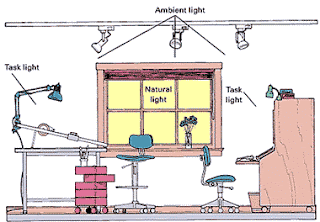
SET BUILD AND LIGHTING DESIGN

The first problem that we came across was where we were going to film the changing room scenes. We managed to narrow it down to the Cranliegh arts centre changing room, and the other studio in the school. We decided that doing it in the other studio would probably be best, as it would be easy to light, easy to get all the filming equipment to and easy for all the actors to get to.

As a group we were given a set design sheet, and also a lighting design sheet. We then spent a lesson together, and also a prep preparing these sheets so we could give them ready, and fully complete to out set designer and lighting designer, Dan. We would also run these plans past Luke and John.


We decided that we wanted to go for the look of the band playing in a back street in London. We decided that we wanted to have a corrugated iron backdrop, so it looked as if they were outside a factory or something alike. We also decided that we wanted to have lots of posters and graffiti on the back drop, however the posters are turning out to be hard to get, and we are still working on this.


From the meeting with Dan, we decided that the simpler we could keep it the better. Because of this we decided to stick with shooting the changing room scene in the other studio, as there are mirrors there, and we decided that the most detailed set we wanted was a pavement and some corrugated iron behind us. Dan said that this would all be possible and so we began to arrange all of our props, and how we would get hold of our posters.


Over all the meeting with Dan, Luke and John turned out a success as we now know exactly how we are going to light our set, and exactly what we would like it to look like.


Wednesday, October 20, 2010

CAMERA TEST

We used the Camera test primarily to see if the actors we had chosen to play in our band looked the part in front of the camera. The first thing that we were looking for was to see if the cast were photogenic. If they looked bad on Camera, or didn’t look like we imaged they would, we would then choose someone else. We were also looking to see if the actors were willing to be directed, and were willing to do exactly what we wanted them to do, because if they were nor, they we would have to get rid of them.

What we found was that our actors worked out just right. They all looked photogenic, they all suited their part and they were all willing to do what we wanted them to do. Because of this we didn’t need to try and find any other actors.

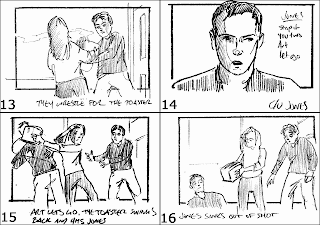
STORYBOARD

The storyboard is fairly much the same as the timeline. Except for this time, you are putting a visual to words, instead of a link of an image to the words. What the storyboard does is it enables the producers and directors to see what they feel works visually for the viewer. Also, if the editor is going to try and achieve a style such as balletic editing, then they can draw each shot to slide into the other. They can also work each shot to please the viewers eye. For example, they can draw the pictures onto the hotspots.

Once you have done all of this, you can film each storyboard shot, one by one, and then put the images to the music in sequence. You do this as closely to what you imagine the video to look like, and then once you have done this you can watch the video back and see if the visual works or if it doesn’t work. What we found with ours was that the majority of the shots worked, especially the final shot of the close up of the bands name on the dressing room door. However, we did find that there were a few to many shots which felt as if they lasted to long. This made the visual slightly more boring, and gave us a chance to correct this and make the video quicker, sharper and more interesting.

Tuesday, October 19, 2010

TIMELINE

There are several different reasons for doing a timeline. The first of these is to give the producer and director of the video a rough visual of what the outcome will look like. For a timeline, what will happen is that the creative mind behind the music video will think through the video, writing down shot by shot what they think the video should look like. In this you will write the amount of time each shot should last, the shot numbers and the types of shot and if there is any, the movement of the shot. Once this has all been done for the whole song, the timeline will be read through and you will have a chance to see if everything feels as if it would all work together. If it doesn’t, you can then do it again, which saves you making a video that wont work.


What we found by doing our timeline was that we had far to many shots that we felt would last either to long, or didn’t feel as if they fitted in with the rest of the piece. We found that there were too many of the same shots, so we ended up putting more variation into the piece when it came to drawing the storyboard, which will be explained in the next blog.


The timeline is also very useful to structure the narrative part of the music video. For example, if you want to have a story running through the piece, as well as having a performance aspect, you can use the timeline to structure this story and decide when you feel the most suitable parts of the piece would be to include this story.

Monday, October 11, 2010

General introduction to composition rules

In the 7 Blogs below, I have written about some of the most important composition rules. They are vital to film making, both making the film a more pleasant watch, and also a more interesting one.

Tuesday, October 5, 2010

The Rule of Thirds

The rule of thirds is all about making the film visually pleasing. In the rule of thirds there are 4 different hot spots on the screen, which as you may have guessed split the screen into thirds. On a diagram, there is a hot spot in the top right, top left, bottom right, and bottom left. In a film the top right is the main hot spot, so usually you would put the hero character in that spot. An example of this is in 'The Wild Bunch'. In this film the character Pike is always in the first hotspot.

If you subvert the rule it makes the film a lot more uncomfortable to watch. Some directors do this on purpose. For example, Stanley Kubrick is one director known for doing this.

Editing Techniques

There are many different ways to edit a film, and all these different types of edeting makes the viewer view the film in different ways. What i mean by this, is that you can edit some films to be a comfortable watch for the viewer, and you can also edit some films to be an uncomfortable watch for the viewer.

One form of editing which makes the film a comfortable watch is called balletic editing. Balletic editing is where each time a shot cuts, the next shot will pick up in the same spot on the screen as the last shot finished. A classic example of Balletic editing was in the film "The Wild Bunch". What ends up happening in balletic editing is that the shots end up forming a cirlce, which is comfortable for the viewer to watch, and easy on the eye.

If you were going to make a film uncomfortable to watch for a certian reason you would do the opposite to balletic editing. For example, when you cut from one shot, insted of the next shot starting in the same place, it would start in a completly different part of the screen. This would be hard on the viewers eye as they would be constantly trying to follow the action.