Wednesday, October 20, 2010

CAMERA TEST

We used the Camera test primarily to see if the actors we had chosen to play in our band looked the part in front of the camera. The first thing that we were looking for was to see if the cast were photogenic. If they looked bad on Camera, or didn’t look like we imaged they would, we would then choose someone else. We were also looking to see if the actors were willing to be directed, and were willing to do exactly what we wanted them to do, because if they were nor, they we would have to get rid of them.

What we found was that our actors worked out just right. They all looked photogenic, they all suited their part and they were all willing to do what we wanted them to do. Because of this we didn’t need to try and find any other actors.
STORYBOARD

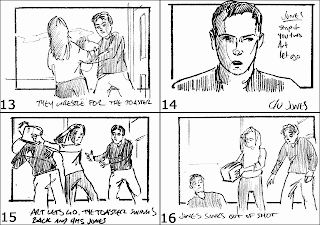
The storyboard is fairly much the same as the timeline. Except for this time, you are putting a visual to words, instead of a link of an image to the words. What the storyboard does is it enables the producers and directors to see what they feel works visually for the viewer. Also, if the editor is going to try and achieve a style such as balletic editing, then they can draw each shot to slide into the other. They can also work each shot to please the viewers eye. For example, they can draw the pictures onto the hotspots.

Once you have done all of this, you can film each storyboard shot, one by one, and then put the images to the music in sequence. You do this as closely to what you imagine the video to look like, and then once you have done this you can watch the video back and see if the visual works or if it doesn’t work. What we found with ours was that the majority of the shots worked, especially the final shot of the close up of the bands name on the dressing room door. However, we did find that there were a few to many shots which felt as if they lasted to long. This made the visual slightly more boring, and gave us a chance to correct this and make the video quicker, sharper and more interesting.

Tuesday, October 19, 2010

TIMELINE

There are several different reasons for doing a timeline. The first of these is to give the producer and director of the video a rough visual of what the outcome will look like. For a timeline, what will happen is that the creative mind behind the music video will think through the video, writing down shot by shot what they think the video should look like. In this you will write the amount of time each shot should last, the shot numbers and the types of shot and if there is any, the movement of the shot. Once this has all been done for the whole song, the timeline will be read through and you will have a chance to see if everything feels as if it would all work together. If it doesn’t, you can then do it again, which saves you making a video that wont work.


What we found by doing our timeline was that we had far to many shots that we felt would last either to long, or didn’t feel as if they fitted in with the rest of the piece. We found that there were too many of the same shots, so we ended up putting more variation into the piece when it came to drawing the storyboard, which will be explained in the next blog.


The timeline is also very useful to structure the narrative part of the music video. For example, if you want to have a story running through the piece, as well as having a performance aspect, you can use the timeline to structure this story and decide when you feel the most suitable parts of the piece would be to include this story.

Monday, October 11, 2010

General introduction to composition rules

In the 7 Blogs below, I have written about some of the most important composition rules. They are vital to film making, both making the film a more pleasant watch, and also a more interesting one.

Tuesday, October 5, 2010

The Rule of Thirds

The rule of thirds is all about making the film visually pleasing. In the rule of thirds there are 4 different hot spots on the screen, which as you may have guessed split the screen into thirds. On a diagram, there is a hot spot in the top right, top left, bottom right, and bottom left. In a film the top right is the main hot spot, so usually you would put the hero character in that spot. An example of this is in 'The Wild Bunch'. In this film the character Pike is always in the first hotspot.

If you subvert the rule it makes the film a lot more uncomfortable to watch. Some directors do this on purpose. For example, Stanley Kubrick is one director known for doing this.

Editing Techniques

There are many different ways to edit a film, and all these different types of edeting makes the viewer view the film in different ways. What i mean by this, is that you can edit some films to be a comfortable watch for the viewer, and you can also edit some films to be an uncomfortable watch for the viewer.

One form of editing which makes the film a comfortable watch is called balletic editing. Balletic editing is where each time a shot cuts, the next shot will pick up in the same spot on the screen as the last shot finished. A classic example of Balletic editing was in the film "The Wild Bunch". What ends up happening in balletic editing is that the shots end up forming a cirlce, which is comfortable for the viewer to watch, and easy on the eye.

If you were going to make a film uncomfortable to watch for a certian reason you would do the opposite to balletic editing. For example, when you cut from one shot, insted of the next shot starting in the same place, it would start in a completly different part of the screen. This would be hard on the viewers eye as they would be constantly trying to follow the action.

Camera Position and Angles

When shooting a film or an interview, you can make people appear differently to the audience by shooting them in different angles and different positions.

There are general rules as to where to place the camera when interviewing someone and shooting them on film. The first of these is the height of the camera. In an interview for the news or a documentary if you dislike the person you can put the camera at a certain height to make them look bad, or oppositely if you like a person, you can put the camera at a visibly satisfying height. If you shoot a person above the camera, it makes them look arrogant, and it also boosts their importance. However if you put the camera above them, it belittles them, and makes them look meaningless and not important.

The most accepted and supposable the best angle and height to shot a person from is at 32 degrees to the subject, and on the same height. This makes them look normal, and also shows the best angles of a persons face.

Camera Movement


There are two main types of camera movement. These are tracking shots, and crain shots. At Hurtwood, we dont use crane shots, however there are tracks so it is optional to use them.


Tracking shots are shots that move from one side to another. they will usually move from left to right as this is known to be more comfortable on the viewers eye.


Crane shots are the opposite to tracking shots. In crane shots the camera moves upwards and downwards. Crane and traching shots can also be used at the same time, however this does become much more difficult to do.

Colours used in film

when deciding how to light a set and what colours to use, the director will usually think about what emotion he wants to portray to the audience. In film, each colour is known to portray a different kind of image, and you can usually tell a lot about a character and the themes of the film through the use of colour. For example, in the film "The Wild Bunch" the colours used are very pasty, drab and seedy. these are colours such as brown. they also used black and white in certian areas. The reasons for this was because they wanted the area to look like a nasty worly with little colour and also the colour blck means bad, which is what the wild bunch were. It also makes the location look like a washed out world.

Different colours are also known to say a lot about a character in a film. You can usuallt tell alot about a character by the clother that they wear, and what colour they are. For example, somebody who wears lots of red is usually known as an outgoing, active and physical person, where as somebody whom wears lots of grey is usually known as self-reliant and independant.

Monday, October 4, 2010

Lighting

For our A level pieces at Hurtwood House we use two different types of lighting. These are redhead lights, and blonde lights. These are the standard types of lights used. They are ranged between 1000 pounds and 1500 pounds. This is artificial lighting which is more commonly known as tungsten.

When lighting a scene there is usually a norm for doing so. The first form of lighting you would usually use would be a spot light directly in front of the subject. This would light the subjects face as well as their body, however usually there will be one side of the face which is slightly shadowed which means you then have to use other lights to extinguish this shadow. This second light is called a fill light. The fill light is usually at 32 degrees to the spot light. This is a comforting angle for the viewer and it will get rid of the shadow on the subject. The third light used is the back light. The back light is usually around level with the subject, however instead of lighting up the subject, the light it set up to aim towards the wall behind the object to bounce back on to the object and give them a feel of depth on camera. This is the light that is used to create a 3d effect.

Types of Shot's

There are six main different types of shot sizes. Each shot size is used by the director to portray a different type of meaning to the audience member, whether it is to describe an emotion on somebody’s face, or whether it do establish an area or the scenery around it. These six main different types of shot sizes are an Extreme close up, a close up, a mid shot, a long shot, an extreme long shot and a wide angle shot.

Extreme close ups are usually used by the director to really put across a characters fear or amazement etc to the audience. They are usually so close to something that you can only see a certain part of the object. For example, if there was an extreme close up on someone’s face it may only be of their eyes, to show their feelings through their eyes.


Close ups are usually used by the director for the same sort of reason that they would use an extreme close up. They would be used to tell the audience what the character was either thinking or feeling. They can be used to introduce a character, so the audience know what he looks like etc. they are also more commonly used that ECU’s are.


Mid shot’s are shots that show a suitable amount of detail of the character to put their emotion across to the audience, yet it is just far away enough to make the audience feel as if they were looking at the whole subject.


Long Shot’s are used to show the entire person and also to relate them to the surroundings around them. In long shots you can see the whole of the person so you can also read the persons body language as the audience member. This can sometimes put across how the audience member is feeling.

In Extreme long shot’s the subject is incredibly small compared to the overall image. They are usually used to show the audience the area, rather to convey some kind of emotion from a character. They can also be used as establishing shots. These are shots that establish something to the audience. For example, they can be used to establish a setting to the audience.

Wide Shot’s are fairly much the same as extreme long shots. They are again used by the director more to show an area rather than putting across the emotion of the subject. And also like ELS’s, wide shots can be used for establishing shots.