 We started off our opening sequence introducing our production company. We got this idea off the films made in Hollywood and the way in which they introduce the production companys (the money people) at the beginging of the title sequence of each film.
 The second credit that we showed was the director name. The reason for this was because we decided to keep the amount of credits used to a minimal, in order to keep the viewers attention on the sequence rather than the writting on the screen. It also makes the sequence more powerfull and effective as there is nothing to distract the viewer. This is also conforming to the Hollywood style, as the directors name is always shown in the opening sequence.
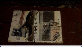
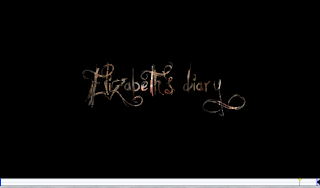
This image was one of the most important images in our whole title sequence. this image sets up the whole film, with the diary being the reason for Elizabeths eventual death and the series of events that lead up to her death. We also wanted to start the sequence with an important image which get the viewer thinking. This conforms to the Hollywood style as in some films they use a legend, where as we give information about the film away through the diary.
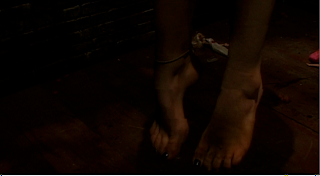
Once again this was an important part of the opening sequence. This was the moment that we first introduced the character of Elizabeth, yet only through a shadow. We also wanted toshow off the set and the distraught immages that we had purposly placed in specific places. This image was suppose to hint to the audience that something bad was happening but without giving anything away. Once again this conforms to Hollywood as in the opening sequence of a film you always see the main character, however we have subverted this by showing her shadow but not her face.
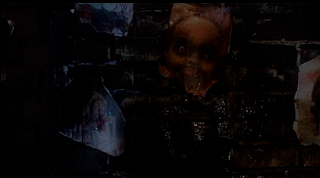
 We needed to emphasise this section of the sequence as it was the first obvious time we saw the intention behind Elizabeths thaughts and the more darker, less comical side to her thaughts. We decided that this point was the start of the darker part of the sequence, so we wanted to make it as strong as we possible could. This conforms to the usual Hollywood horror as in the opening sequence they use powerfull gory images, to create a feeling of tension.
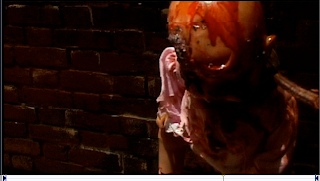
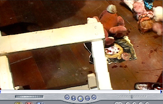
This was the part of the sequence where we really expressed Elizabeths thaughts and emotions, through the set and the camera movement. This was the first clue as to what Elizabeth was going to do and it is also one of the most graphical pointsa of the sequences, using the disturbed image of a baby hanging. This once again conforms to the Hollywood style of horrors, as you can see hanging, and mutilation.
This was one of the hardest parts of the sequence to do. We decided that we wanted to photoshop a title card, which would be the same title card we used throughout the whole process of the film. This included the advertising, the dvd case, the cinema and everything else which includes Elizabeths diary. We got this idea from Hollywood, how all of the films have their one logo, which is used for everything. For example, Batman has the black bat with batman writter underneath it. We spent the most time on this part of the sequence.

No comments:
Post a Comment